The $9 Experiment That Rewrote the Rules of Selling
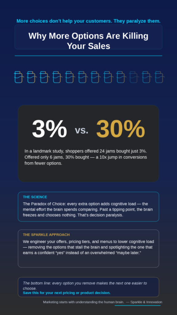
Picture two grocery-store tasting booths. One offers 24 gourmet jams. The other offers just 6. The bigger display pulls a bigger crowd — but when it comes time to actually buy, only 3% of the 24-jam shoppers reach for their wallets. At the 6-jam booth, 30% do. That is a tenfold jump in sales from doing less. This is choice overload in action, and it is quietly draining revenue from businesses that believe they are being generous by offering more.
If your pricing page has seven tiers, your service menu runs three scrolls deep, or your homepage greets visitors with a dozen equally weighted buttons, you are not giving customers freedom. You are giving them a reason to leave and “think about it.” Here is the science behind why that happens — and what to do instead.
The Famous Jam Study: 3% vs. 30%
The tasting-booth experiment is real. In 2000, psychologists Sheena Iyengar and Mark Lepper ran it as a controlled field study and published the results in the Journal of Personality and Social Psychology. Shoppers were drawn to the extensive 24-jam array, but they were ten times more likely to purchase when faced with only six options. Participants also reported feeling more satisfied with their choice when the menu was smaller. You can read the original write-up from Columbia Business School here.
The takeaway is counterintuitive and worth sitting with: more variety attracted attention but destroyed action. Attention is not the goal. A confident “yes” is.
What Choice Overload Actually Is
Choice overload (sometimes called the paradox of choice) is the point at which adding more options stops helping a person and starts hurting them. Every additional option a customer has to evaluate adds cognitive load — the mental effort the brain spends comparing, weighing, and deciding. A little is fine. Past a certain tipping point, the brain hits its limit.
This is not a niche marketing theory; it is a well-documented principle in human–computer interaction and behavioral science. The design community formalized it as a core usability rule — see the Choice Overload entry in Laws of UX — and it sits right alongside Hick’s Law, which states that the time it takes to make a decision grows with the number and complexity of options.
Why the Brain Freezes: The Neuroscience of Decision Paralysis
When the number of options exceeds what working memory can comfortably hold, the brain does something predictable: it protects itself. Faced with too much to compare, it defaults to the single easiest decision available — making no decision at all. Psychologists call this decision paralysis. In your sales funnel, it looks like an abandoned cart, an unanswered proposal, or a “let me get back to you” that never comes.
Crucially, the customer rarely blames the menu. They blame themselves for being “too busy” or “not ready,” and they walk away with a faint negative feeling attached to your brand. That emotional residue matters more than most owners realize — it is the same reason we argue that marketing alone isn’t enough without brand-level trust built on how the brain actually works. Reducing cognitive load is not about dumbing things down. It is about respecting a finite resource — your customer’s attention — and spending it wisely.
Where Choice Overload Is Quietly Killing Your Revenue
Most businesses have several leak points and never connect them to the same root cause. Look closely at these four:
- Pricing tiers. Five or six plans feel thorough to you and overwhelming to a buyer. Research on SaaS pricing consistently lands on three to four tiers as the sweet spot — enough to serve different segments without triggering paralysis. The way you frame those tiers matters too; the Decoy Effect shows how a well-placed “middle” option quietly sells the plan you want.
- Service menus. A consultancy or clinic that lists 20 services with equal weight forces the prospect to become their own strategist. They can’t, so they stall.
- Pricing presentation. Even the digits you choose carry psychological weight — the difference between $9.80 and $10.00 is far larger in the mind than in the bank account, as we explained in The $9.80 Barrier and the Left-Digit Effect.
- Website and email calls to action. When every link looks equally important, none of them is. One primary action per page consistently outperforms a wall of equal buttons.
How to Fix It: Four Principles That Lower Cognitive Load
You don’t fix choice overload by removing value. You fix it by engineering the path to a decision. Four principles do most of the work:
- 1. Curate. Cut the options that exist only because removing them felt scary. If a tier or service hasn’t earned its place in 12 months, it is adding load, not revenue.
- 2. Sequence. Don’t show everything at once. Reveal options in steps — qualify, then present the two or three choices that actually fit. A guided path beats a giant grid.
- 3. Spotlight. Give the brain a shortcut. A clearly marked “Most popular” or “Recommended” option removes the burden of comparison and reassures the undecided buyer that someone has already done the thinking.
- 4. Reduce friction. Every extra form field, click, and ambiguous label is another small decision. Strip them down to the essentials.
Notice that none of these is about being “cheaper” or “louder.” They are about being clearer — and clarity is a competitive advantage that most of your competitors are too afraid to claim.
The Sparkle & Innovation Approach
At Sparkle and Innovation, we start every engagement from the same premise: marketing starts with understanding the human brain. When we audit a client’s offers, pricing tiers, and customer journey, we are not asking “what looks impressive?” We are asking “where is the brain being overloaded, and what is that costing in conversions?”
From there we engineer the offer architecture — curating what to keep, sequencing how it’s revealed, and spotlighting the option that earns a confident “yes” instead of an overwhelmed “maybe later.” It is the difference between decorating a storefront and designing a decision. If you’ve ever wondered what actually separates a professional marketer from someone simply “doing marketing,” this is it: the pro designs for how people decide, not just how things look.
The Bottom Line
Every option you remove makes the next one easier to choose. Choice overload is invisible until you measure it — and then it shows up everywhere: in the pricing page nobody finishes, the proposal that goes cold, the menu that impresses but doesn’t sell. Fewer, clearer, better-sequenced choices don’t shrink your business. They unlock it.
If your offers or pricing have quietly grown into a maze, that is a fixable problem — and a profitable one to fix. Learn how to choose a partner who can redesign your decisions the right way, or reach out to Sparkle and Innovation for a conversion-focused review of your offers. Sometimes the fastest way to grow is to give your customers less to think about.
Marketing starts with understanding the human brain. — Sparkle & Innovation

